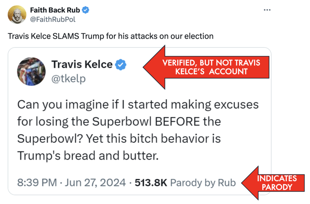
The other day I checked in on Twitter (Still can’t bring myself to say X) and saw this tweet:

About a year ago, Twitter started injecting tweets into my “notifications” stream from people I don’t follow. So, I don’t know Faith Back Rub. Never heard of the account before. And yet, Twitter’s algorithm somehow thought this was one of the most important things for me to see that day.
The message I received was “a famous American football player slammed a presidential candidate.” And then I went on to something more interesting in my busy day.
But then I thought about it a little more: this celebrity American football player is usually non-political. He makes millions in product endorsements and podcast sponsorships. This statement seems uncharacteristic. So I went back to the tweet and clicked on the actual Kelce message:

Now my reaction was — well, this is a verified account. Looks like Travis Kelce really did take a clever swipe at Trump. Surprising. But what is this “Parody by Rub” thing in the corner? Is this real or not? Now, I had to dig to figure out what was going on. And here’s the truth:

This did not come from Travis Kelce, but how would I obviously know that? Remember how this showed up in my news feed: There was no indication that this was fake news when it was displayed to me. I read the headline and moved on.
As it turns out, most people who clicked through were fooled by this tweet, even though it was identified as a “parody.” I know this because there were nearly 1,000 comments on this tweet, most of them Trump supporters blasting Travis Kelce — who had nothing to do with this opinion.
And this is the true problem with social media. The threat to our society doesn’t necessarily come from what people say, it comes from algorithms amplifying disinformation.
The implication of amplification
Everybody has a right to say what they want to say, even if it’s incorrect or controversial. When the American Founding Fathers drafted the Constitution, even the most powerful and compelling voice back then could only hope that somebody would read their pamphlet or hear a speech. Information spread slowly, and mostly, locally. Even a juicy conspiracy theory couldn’t get nationwide attention very easily.
But today, damaging content can spread instantly and globally. And that puts a new spin on the issue of free speech.
U.S. Supreme Court Justice Oliver Wendell Holmes famously said there is a limit on free speech: “You can’t yell ‘fire’ (with no fire) in a crowded theater.” But today, anybody can yell fire, and it can impact the opinions of hundreds, thousands or even millions of people. Amplification matters. Amplication is the threat. Why isn’t anybody taking responsibility for this?
Social media companies must be accountable
Let’s think through the case study I presented today.
- Twitter’s algorithm—no human being—decided to amplify news clearly marked as fake into user news streams without indicating that it was a parody (the first screenshot above).
- Based on the comments, two-thirds of the recipients of this tweet thought it was real, or 342,000 people.
- But that’s just the beginning. This fake news was retweeted 7,700 times!
This example was relatively harmless. The parody tweet probably caused Travis Kelce some irritation, but maybe that goes with the life of a celebrity.
However, what if this amplified fake tweet was devastatingly serious?
- What if a “verified account” called off evacuations in the middle of a hurricane?
- What if a fake account said every computer was hacked and would blow up today?
- What if the tweet accused Travis Kelce of beating up his girlfriend Taylor Swift?
My point is that Twitter and any other platform that employs algorithms to knowingly spread false claims should be held accountable.
In a recent interview, author and historian Yuval Noah Harari made this comparison: People can leave any comment they want on an article in The New York Times, even if it’s false. But amplification from social media companies is like the newspaper taking a bizarre, false comment and putting it on the front page of their newspaper.
That’s irresponsible and dangerous to society. Nobody would stand for that. And yet, we do.
Aim at amplification
As we enter the AI Era, the danger of fake news and its implications grows profoundly.
Let’s cut to the chase — Twitter knowingly lied to me to increase my time on their site and benefit its bottom line.
While it would be nearly impossible for any platform to monitor the comments of millions (or billions) of users, it’s much easier to hold companies accountable for spreading known false information to innocent people. This is a simple first step to protect people from dangerous falsehoods.
Why is nobody talking about this? Addressing bot-driven “sensational amplification” is a much easier fix than trying to regulate or suppress free speech. This must be a regulatory priority.
 Need a keynote speaker? Mark Schaefer is the most trusted voice in marketing. Your conference guests will buzz about his insights long after your event! Mark is the author of some of the world’s bestselling marketing books, a college educator, and an advisor to many of the world’s largest brands. Contact Mark to have him bring a fun, meaningful, and memorable presentation to your company event or conference.
Follow Mark on Twitter, LinkedIn, YouTube, and Instagram


 You’re in marketing for one reason: Grow. Grow your company, reputation, customers, impact, profits. Grow yourself. This is a community that will help. It will stretch your mind, connect you to fascinating people, and provide some fun along the way. I am so glad you’re here. -Mark Schaefer


