By Kiki Schirr, {grow} Contributing Columnist
Last year I stumbled across one of those customer experiences that makes you want to tear your hair out—and preferably stuff it down the offending company’s throat.
I had started writing more and decided that I would take some time off from the side work I do hourly to support my Fittr/startup lifestyle. So I went to my freelance hour-tracking software service and looked for a “pause” option, so that I wouldn’t have to pay $20/month for 2–3 months.
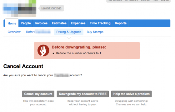
These were the three options given:
 And there, in the center, was the option I definitely wanted: to “pause” my account.
So I was excited it would be so simple, and clicked the button.
But I got an error message.
“Reduce the number of clients to 1“
They wanted me to go through and delete all my accounts? I couldn’t do that! I had somewhere around ten customers listed—and two of which were the only places I had stored their company’s contact information.
I looked at the choices again. Was it worth paying $20 to keep that information? Probably, yes.
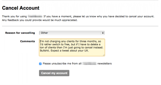
And I wouldn’t have canceled at all—except that I was pissed. What a poor customer experience! And with righteous indignation, I copied a little information from the account and closed it entirely.
(but not before sending them a nastygram about their UX –not my proudest moment)
A few days later they wrote back to me and very kindly admitted that their cancelation policy was dumb. In fact, they even said their old policy was so flawed that—
“We made it easier for customers to cancel than to stay!”
So I felt a lot better about writing to them. And when I started billing clients again, I went back. Their service really is excellent, and I had been very happy with it. I felt guilty for sending them a note at all, but their UX had been completely illogical, so maybe, my anger and nastygram had helped in a way?
I couldn’t stop thinking about it, though. How had they decided upon a user experience that would enrage a small group of customers?
And then I remembered that thought I’d briefly had: ‘maybe it was worth $20 just to keep the information.’
In an A/B test, I have no doubt that this would have decreased the number of cancellations.
After all, they had increased the pain of leaving.
What an A/B test doesn’t show, though, is how much a customer hates you for it.
…it misses the human element.
I mean, that’s not the only thing flawed about A/B tests. Don’t get me wrong.
There’s also the problem of statistical significance.
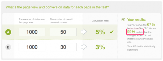
If you search significance of A/B testing, Wikipedia gives you the following scenario:
Email test group A: 50 out of 1000 (5%) success rate
Email test group B: 30 out of 1000 (3%) success rate
We’re all going to go with test group A, right?
Kiss Metrics provides this misleading tool, which gives the following analysis:
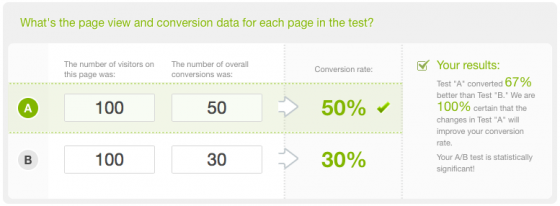
But then, when you play around with the calculator a bit, you realize something’s wrong…
Wait—800 fewer tests, and I still get the same results?
It doesn’t take the size of the pool into account WHATSOEVER. Whoops!
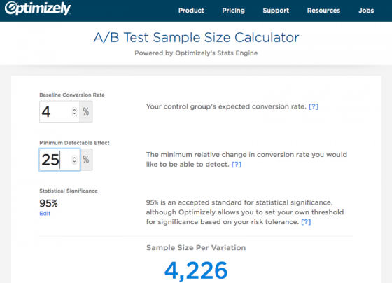
Whereas Optimizely provides this useful tool:
Basically, to test for significance of a 25% change off of an expected 4% conversion rate… well, you’d need to send it to more than twice as many subscribers than you actually have.
Whoops.
So yeah. Don’t always trust an A/B test without putting some serious thought into it.
My best suggestion? Narrow it down to a few options, sleep on it, and then in the morning pretend you are a new customer seeing your emails for the first time. How do they make you feel?
Empathy will get you a long way in UX.
 Kiki Schirr is a cofounder of the fitness app Fittr, and also does the company’s marketing. Her latest project is a lifestyle magazine for women in STEM called Valley Girl — she would love for you to check it out! Kiki is also the author of Tech Doodles, and can be reached easily through Twitter.
Images are screen captures taken by Kiki Schirr



 You’re in marketing for one reason: Grow. Grow your company, reputation, customers, impact, profits. Grow yourself. This is a community that will help. It will stretch your mind, connect you to fascinating people, and provide some fun along the way. I am so glad you’re here. -Mark Schaefer
